A moving-company homepage should quickly help a visitor decide whether the business fits their move and what to do next. The first screen does not need to explain every service or display every trust signal. It needs a clear starting point that remains understandable on the device the customer is using.
 View full-size graphic ↗
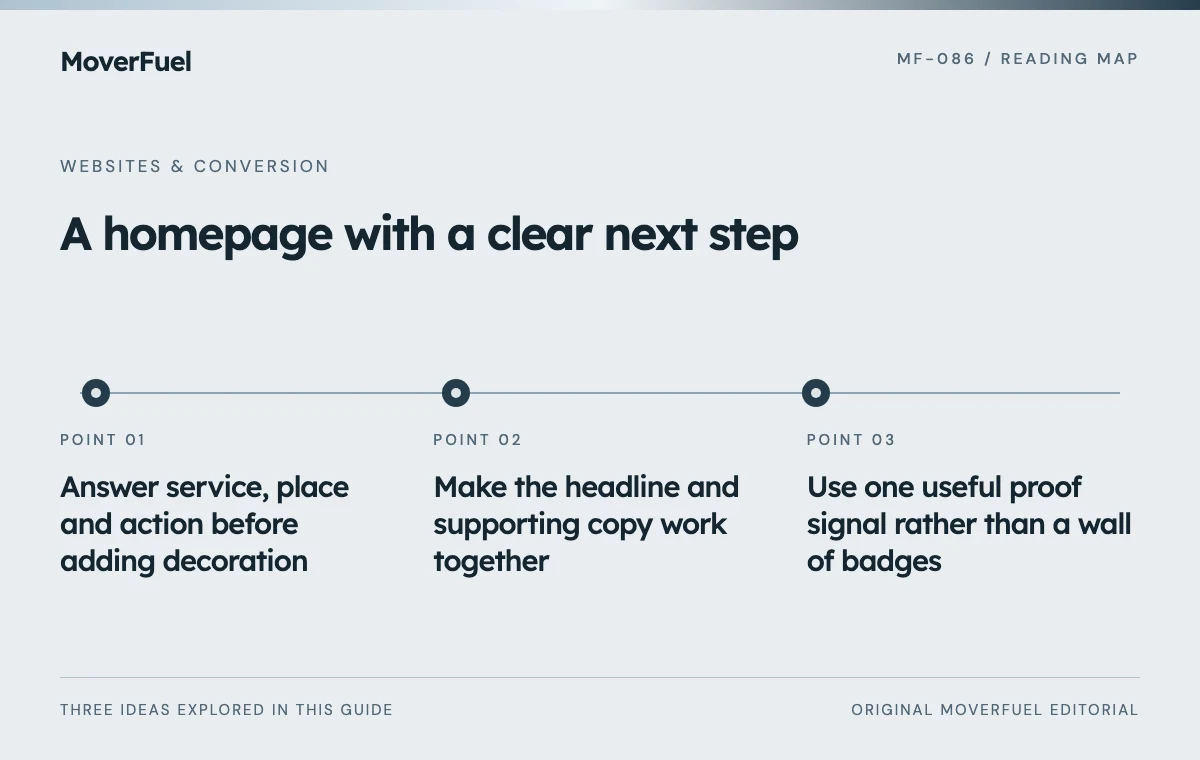
Answer service, place and action before adding decoration
Review the first screen as a new customer. Can you tell what kind of moving work the business handles, where it operates and how to begin? A clever slogan may be memorable but still leave all three questions unanswered.
Scroll the table horizontally to compare all columns.
| Question | Useful evidence | Common ambiguity |
|---|---|---|
| What can I hire you for? | Specific service description | A broad slogan with no service context |
| Can you serve my move? | Accurate operating coverage | A city image that implies an office |
| What should I do now? | Clear quote or call action | Several equally prominent unrelated buttons |
| Why should I continue? | Relevant, verifiable proof | Unsupported superlatives or stock credibility badges |
This rubric is for evaluating moving-company client websites. It is not a reason to redesign an already approved page without a documented problem. Preserve working design decisions and test whether a specific customer question remains unresolved.
Make the headline and supporting copy work together
Use the headline for the main service promise and the supporting sentence for necessary context. Avoid stuffing every city and service into one line. A local household mover and a commercial relocation specialist need different explanations because the visitor’s decision is different.
A specificity test for the copy
Compare ‘We make every journey better’ with a sentence that identifies the actual service and market. The second version may be less poetic but gives the visitor something to evaluate. Use only coverage and capabilities the company can support; clarity does not require exaggerated speed or price promises.
Read the copy without the background image. If the service becomes unclear, the image is carrying essential information that some visitors may miss. Then review the complete composition to ensure text contrast and crop do not undermine readability.
Use one useful proof signal rather than a wall of badges
Choose evidence relevant to the first decision: an authentic review source, a real team image or a verifiable credential where appropriate. Explain what the evidence means. A badge with no source or context can look decorative rather than trustworthy.
Scroll the table horizontally to compare all columns.
| Asset | Check before displaying |
|---|---|
| Review quotation | Real source, accurate wording and permission where required |
| Rating summary | Current value, source and clear scope |
| Credential | Correct entity, current status and relevant meaning |
| Crew or fleet image | Authentic company asset and approved use |
Do not use a sample dashboard, illustrative statistic or fictional concept as proof of customer results. If real evidence is unavailable, prioritize a clear explanation of the service and process while collecting approved material.
Make the main action describe what happens next
A quote request, a callback request and an instant booking are different actions. Label the button and destination accordingly. If the next step is an estimator contacting the customer, do not imply that clicking confirms a price or reserves a crew.
A phone action can be useful for urgent questions, while a form can collect information outside office hours. Decide which is primary based on the operation and customer task. Keep the alternative available without making the first screen a menu of competing offers.
Check the destination with the moving quote form guide. A clear homepage button cannot compensate for a form that fails to deliver the request.
Test comprehension and stability on real screen sizes
There is no single fold position across phones, browser controls and accessibility settings. Check whether the essential meaning remains visible and whether the next action is easy to reach. Do not shrink all text simply to force every desktop element into the first mobile viewport.
Web Vitals separates loading, responsiveness and visual stability through LCP, INP and CLS. Use those measures to investigate the experience rather than judging the hero by appearance alone. [1]
Ask a reviewer unfamiliar with the business to describe the offer and next step after a brief look. Then test the actual call or form path. Record misunderstandings, not just whether the reviewer likes the design. If changes are made, compare qualified inquiry outcomes and account for other campaign changes.
Preserve images, fonts and layout that already work unless evidence identifies a defect. The purpose of the checklist is a focused comprehension review, not a mandate for a generic hero template.
Common questions
Must every CTA be visible before scrolling?
No. Prioritize the main action and essential context. Secondary information can follow naturally without crowding the first screen.
Is a large background image always bad for conversion?
No. Evaluate readability, relevance, loading and the actual inquiry path. The image’s size alone does not establish its effect on qualified leads.
Your next step
Use the first screen to establish service fit, geography and a credible next step. Test comprehension and function before changing a design that may already serve those needs.
Sources & editorial notes
Platform claims cite the documents below. Operating frameworks and labeled examples are MoverFuel editorial analysis, not client results or industry benchmarks.
- web.dev: Web VitalsLCP, INP and CLS represent loading, interactivity and visual stability. Homepage rubric is original editorial guidance, not a universal layout rule. Reviewed .