
A customer should not need to understand your internal departments to find the right moving service. Navigation works when it answers a few practical questions: can this company handle my move, does it serve my route, what happens next and how do I contact it? Organize the menu around those decisions rather than every keyword the business wants to rank for.
 View full-size graphic ↗
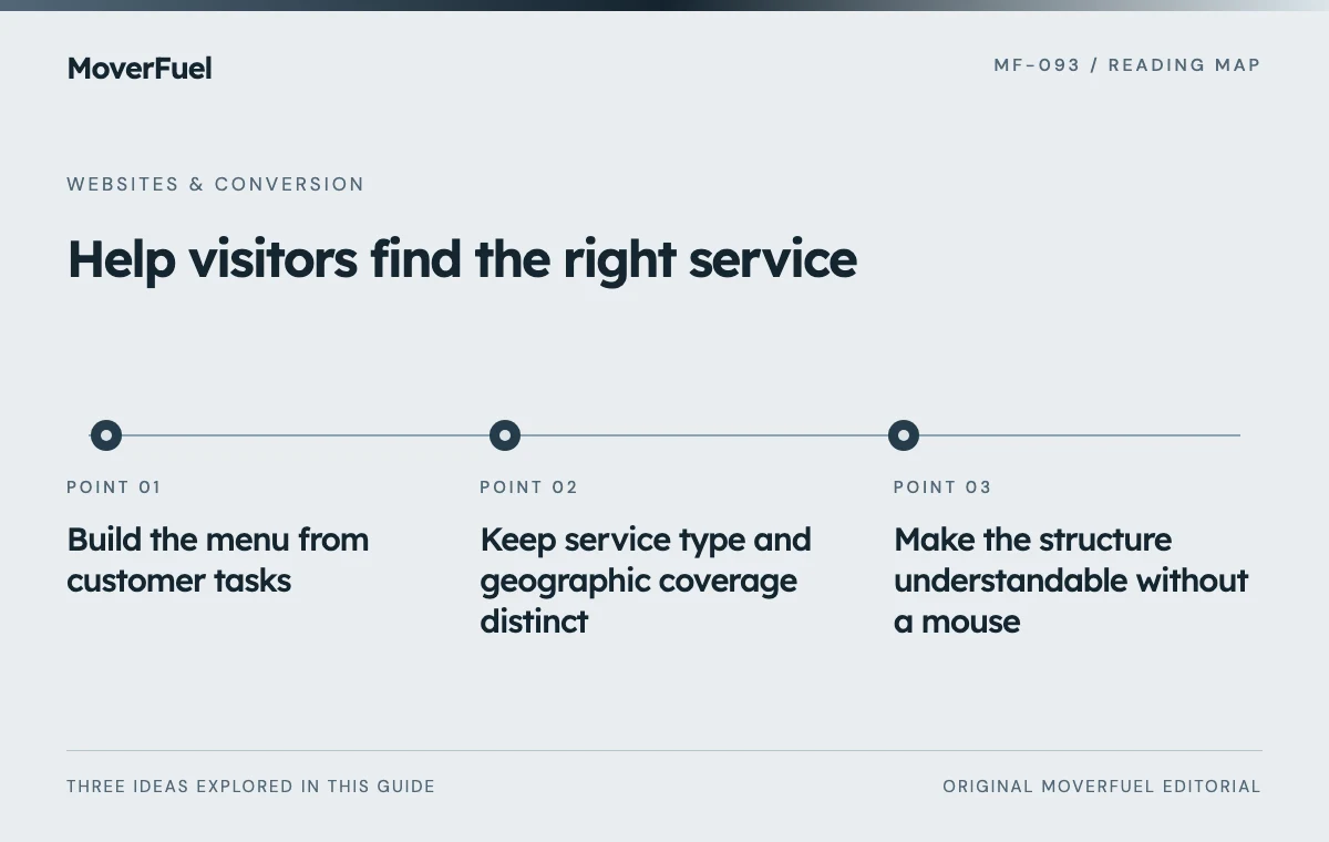
Build the menu from customer tasks
Collect common questions from inquiry records and sales conversations. Separate service selection, geographic coverage, trust evaluation and contact. A person moving an apartment across town has a different first question from a facilities manager arranging an office relocation, but both should find a clear path without reading the entire site.
Scroll the table horizontally to compare all columns.
| Visitor task | Useful destination | Avoid |
|---|---|---|
| Choose a move type | Services hub and distinct service pages | Internal department names |
| Check coverage | Service-area overview or real branch page | An unstructured list of every city |
| Understand the company | About, process and verified proof | Unsupported award labels |
| Request an estimate | Clear quote or contact route | Several differently named duplicate forms |
| Manage an existing move | Customer support instructions | Sending every query to new-sales intake |
Use customer language in labels. ‘Commercial moving’ usually describes a service more clearly than an invented package name. If a branded term matters, explain it on the destination page instead of making it the only clue in the menu.
Keep service type and geographic coverage distinct
Services explain what the business does. Coverage explains where and under what conditions it does it. Combining both into dozens of menu entries such as city-plus-service variations makes the menu difficult to scan and creates pressure to publish repetitive pages.
For a single-market mover
A compact services menu and one useful coverage overview may be sufficient. The coverage page can explain local boundaries, longer-route inquiries and how customers confirm availability. Create a separate area page only when it has meaningful information beyond a swapped city name.
For a multi-location business
Use a locations hub that leads to genuine branch information. Clarify whether contact details, services and estimate handling differ by branch. Keep the selected location visible where it affects the inquiry, and provide a way to change it without losing work.
Make the structure understandable without a mouse
W3C guidance recommends semantic structure for menus, including lists, navigation regions and a way to identify the current item. Distinct navigation regions need useful labels when necessary to tell them apart. [1]
Test the actual interaction, not just the expanded screenshot. A keyboard user should be able to reach a menu trigger, open its content, follow a link and close the menu predictably. Touch users should not need a hover state. Avoid controls that unexpectedly navigate when the user is trying to expand a submenu.
Keep mobile menus within the viewport and allow their contents to scroll when needed. Check long service names and text enlargement. The close control must remain usable, and focus should not disappear behind an overlay after the menu closes.
Use ordinary links for destinations and buttons for actions such as opening a panel. Preserve visible focus styles. An animation can make the menu feel polished, but it should not delay access or conceal which item is selected.
Let hubs and breadcrumbs carry the secondary structure
The header does not need to teach the whole website. A services hub can compare options; a detailed service page can link to relevant coverage, preparation guidance and the estimate process. Breadcrumbs help a visitor arriving from search understand where the page belongs.
Connect navigation planning to moving-company website design so page relationships, content and inquiry handling are considered together.
Preserve useful existing URLs when reorganizing the menu. Changing a label does not require changing the route. If a page genuinely moves, plan the redirect and update internal links rather than leaving the old path to fail.
Scroll the table horizontally to compare all columns.
| Test person starts on | Task to complete |
|---|---|
| Homepage | Find whether office relocations are offered |
| Article from search | Find a relevant service and request an estimate |
| Branch page | Confirm which office handles the inquiry |
| Mobile service page | Open and close the menu using touch and keyboard |
Evaluate comprehension before counting menu clicks
Ask people unfamiliar with the site to complete a small set of tasks without coaching. Record wrong turns, unclear labels and dead ends. A high menu-click count can indicate confusion rather than engagement; the important question is whether the visitor reaches a useful destination.
When revising an approved design, separate information changes from appearance changes. Often a label, link destination or hub explanation can solve the problem while preserving the established header. Test the final menu at desktop and mobile widths, then check every destination.
Keep a navigation inventory with destination, purpose and owner. Review it when services or branches change so retired offerings do not remain prominent and new pages do not accumulate without a clear place in the structure.
Common questions
Should every city have a link in the main menu?
No. Use a useful coverage hub and link to distinct area pages where they add real information. A long city list is not a substitute for clear coverage.
Does renaming a menu item require a new URL?
Usually not. Preserve an established route when it still represents the page, and change the display label independently.
Your next step
A clear moving-company menu organizes decisions, not keyword variations. Keep services, coverage and contact paths understandable, then verify them with real tasks.
Sources & editorial notes
Platform claims cite the documents below. Operating frameworks and labeled examples are MoverFuel editorial analysis, not client results or industry benchmarks.